← Cinematique Visual Effects & Promptable FX · Basic

Sepia Tone Prompt for AI Image & Video

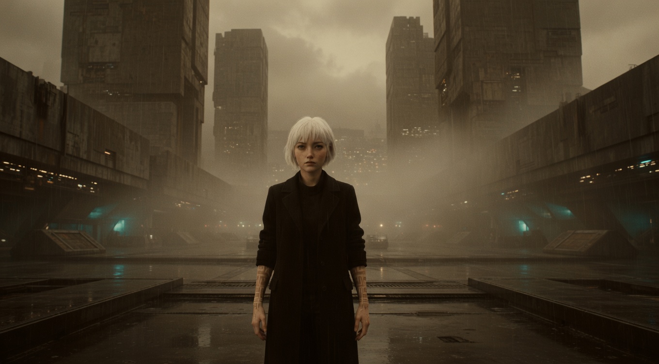
Sepia Tone cinematic example

A warm brownish-yellow color treatment that evokes aged photographs and historical periods, instantly signaling "the past" and adding a romantic, weathered quality. The sepia effect mimics the actual chemical toning process used on photographs from the 1860s through the early 1900s. The Coen Brothers used a digital sepia grade throughout "O Brother, Where Art Thou?" to evoke Depression-era America. Spielberg used sepia-tinted bookend sequences in "Saving Private Ryan." Jean-Pierre Jeunet's "A Very Long Engagement" and Baz Luhrmann's period films use warm sepia tones to romanticize historical settings. The technique has become visual shorthand for memory and nostalgia.

By Ivan Flugelman · Reviewed 16 July 2026

Prompt template

Sepia-toned treatment on [Subject], the warm brownish-yellow transforming the image into what appears to be an aged photographic plate, the entire color spectrum collapsed into variations of amber and umber, highlights tinged with pale gold and shadows falling to chocolate brown, visible grain and slight vignetting reinforcing the antique quality, the universal visual language that tells the audience "this was a long time ago"

Replace [Subject] with your own character or scene. The prompt is technology-agnostic and works as a starting point for AI image or video generators.

When to use Sepia Tone

Use sepia tone when the image should immediately suggest history, memory, an old photograph, or romantic distance from the present. It fits archival inserts, period bookends, family recollection, and deliberately weathered visual worlds. The treatment is a strong shorthand, so pair it with period-appropriate composition and surfaces. Do not rely on brown color alone to carry an otherwise modern scene into the past.

Directing the AI

Collapse the palette into amber, umber, pale gold, and chocolate brown while retaining a full range from highlight to shadow. Add fine visible grain, slight edge vignetting, and restrained softness consistent with an aged photographic plate. Keep faces and important objects separated by value, not color. Remove modern color accents that would puncture the treatment. Apply the same tonal curve across the sequence so the sepia world feels coherent rather than intermittently filtered.

Common mistakes

  1. Applying a flat brown overlay that stains whites and blacks without creating a convincing tonal range.
  2. Keeping bright modern color accents in frame, which breaks the historical shorthand of the sepia treatment.
  3. Adding extreme scratches and damage until surface effects overwhelm faces, actions, and the intended emotional memory.
Sources and further reading

  1. Inventing Worlds and Characters: Effects — Academy Museum
  2. Stories of Cinema — Academy Museum

A technique is one decision. A world is the system.

Fog, smoke, dust and haze are not effects. They are the layer that decides how far you can see, and therefore how large the world is.

Read Atmosphere in full, free, or start with the thirteen fundamentals for building consistent characters, environments, visual logic, and stories that expand beyond one beautiful frame. There is also World Building Codex 3.0, free, and the World Building Academy.

Related techniques

Film Grain

The visible texture of chemical film stock — random variations in density and color that give analog footage its organic, tactile character, often added digitally for warmth and nostalgia. Christopher Nolan and Quentin Tarantino remain committed to shooting on actual film stock, preserving the authentic grain of celluloid. Steven Soderbergh shot "Traffic" on different film stocks to differentiate storylines. Modern digital films frequently add film grain in post-production — David Fincher, despite shooting digitally, adds carefully calibrated grain to every frame. The resurgence of film grain aesthetics in photography and video reflects a cultural desire for the organic imperfection that digital capture eliminates.

Desaturation

Reducing color intensity in the image, moving toward grayscale to create a bleak, documentary, or dreamlike quality — partial desaturation can isolate a single color for dramatic effect. Steven Spielberg used near-total desaturation in "Schindler's List" with the famous exception of the girl's red coat, creating one of cinema's most iconic selective-color moments. Ridley Scott desaturated "Black Hawk Down" for combat realism. "Sin City" by Robert Rodriguez uses radical desaturation with selective color to recreate Frank Miller's graphic novels. Janusz Kamiński's desaturated look for "Saving Private Ryan" established the visual template for modern war films.

Flashback

A scene that takes the audience back to an earlier point in time, revealing backstory, providing context for present behavior, or recontextualizing what we thought we knew. "Citizen Kane" is structured entirely around flashbacks as reporters investigate Charles Foster Kane's life. Francis Ford Coppola's "The Godfather Part II" masterfully interweaves flashbacks of young Vito Corleone with the present-day story of his son Michael. Christopher Nolan uses fragmented flashbacks as a structural principle in "Memento," where the reversed chronology makes every flashback a revelation. Terrence Malick's "The Tree of Life" uses flashback as pure sensory memory, evoking childhood through images rather than plot.

Color Grading

The process of altering and enhancing color in post-production to create a specific mood, era, or visual identity — the final paintbrush of cinema, transforming raw footage into visual art. The Coen Brothers' "O Brother, Where Art Thou?" (2000) was the first major film to be entirely digitally color graded, creating its sepia-toned Depression-era look. David Fincher works obsessively with colorist Stephen Nakamura to achieve the sickly green-yellow palette of "Se7en" and the cold precision of "Zodiac." Steven Soderbergh used radical color grading in "Traffic" — amber for Mexico, blue for the US, natural for Ohio — as a narrative device. Modern colorists like Company 3's Stefan Sonnenfeld and Technicolor's Peter Doyle are as essential to a film's look as the cinematographer.

Bokeh

The aesthetic quality of out-of-focus areas, particularly light sources that become soft, circular orbs — beautiful bokeh creates a dreamy, luminous background that elevates any subject. The term comes from the Japanese word for "blur," and the quality of bokeh varies dramatically between lens designs. Anamorphic lenses produce distinctive oval bokeh, seen in J.J. Abrams' "Star Trek" and Ridley Scott's "Blade Runner." Wong Kar-wai and Christopher Doyle exploit bokeh as a primary aesthetic element in "In the Mood for Love." The rise of large-sensor cameras has made cinematic bokeh accessible to independent filmmakers, and the distinctive bokeh of vintage lenses has driven a renaissance in legacy glass from Helios, Canon K35, and Cooke Speed Panchro.

Forced Perspective

Using the relationship between camera position and object placement to create optical illusions of size — Hobbits appear small next to Gandalf through precise staging rather than CGI. Peter Jackson used forced perspective extensively in "The Lord of the Rings," building oversized and undersized duplicate sets and using precise camera alignment to make Elijah Wood appear four feet shorter than Ian McKellen in the same frame. Jean-Pierre Jeunet used forced perspective for whimsical effect in "Amélie." The technique dates back to the earliest days of cinema and architecture — Egyptian temples and Baroque churches used the same principle to appear larger than they are.

Lens Distortion

Optical aberrations from specific lenses that bend, stretch, or warp the image — wide-angle barrel distortion, anamorphic oval bokeh, or vintage lens flaring — each lens has a personality. Emmanuel Lubezki exploits wide-angle distortion in his work with Terrence Malick, using ultra-wide lenses that bend the edges of reality. Roger Deakins prefers Arri/Zeiss Master Primes for their clinical precision, while Robert Richardson often chooses older, imperfect glass for its character. The anamorphic distortion of Panavision C-series and E-series lenses — their signature flares, edge softness, and oval bokeh — has become synonymous with the "cinematic look." Modern lens designers at Cooke, Arri, and Zeiss carefully engineer specific amounts of controlled aberration.

Morphing / Dissolve Effect

A digital transformation effect where one form smoothly dissolves, transmutes, or reshapes into another — character dissolving into particles, liquid metal transformation, ethereal dissolution, matter transmutation. Originally pioneered by ILM for the T-1000 in "Terminator 2," morphing has evolved from face-to-face blending into a rich vocabulary of transformation effects. In AI image and video generation, morphing and dissolve effects are among the most promptable visual transformations, allowing creators to depict characters dissolving into elements, reforming from abstract matter, or undergoing surreal metamorphosis.