← Cinematique Composition · Intermediate

Visual Weight Prompt for AI Image & Video

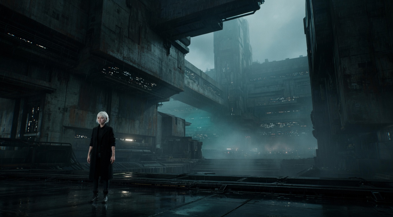
Visual Weight cinematic example

The perceived heaviness of elements in a composition based on size, color, contrast, texture, and isolation — understanding visual weight is key to creating balanced or deliberately unbalanced frames. Akira Kurosawa demonstrated extraordinary sensitivity to visual weight in "Ran," balancing armies against landscapes with painterly precision. Wes Anderson manipulates visual weight through color — a single bright element against a muted background carries enormous visual mass. Roger Deakins understands that a small bright area in deep shadow can outweigh a large dark area, using this principle to control attention throughout the Coen Brothers' filmography.

By Ivan Flugelman · Reviewed 16 July 2026

Prompt template

Visual weight study with [Subject] as a small but vivid element carrying visual mass disproportionate to its physical size through isolation, color saturation, and tonal contrast, the composition deliberately exploring how chromatic density creates perceived heaviness independent of actual size, shot on a 35mm lens at f/5.6 with clinical sharpness throughout

Replace [Subject] with your own character or scene. The prompt is technology-agnostic and works as a starting point for AI image or video generators.

When to use Visual Weight

Think in visual weight when a composition feels wrong despite correct spacing or grid placement. Brightness, saturated color, sharp detail, isolation, and faces can make a small element outweigh a much larger quiet form. The principle helps balance asymmetrical frames or create deliberate unease. Use it during environmental portraits, ensemble staging, and graphic compositions. Judge what the eye notices first and how long it stays there, not only how much physical area each element occupies.

Directing the AI

Identify the primary visual mass, then control its size, brightness, color saturation, texture, and isolation. Counter it with another element whose combined qualities create the desired balance, even if its physical size differs. Keep low-priority areas quieter through reduced contrast and detail. Test the eye path from first glance to secondary anchor. For video, account for moving weight: a small bright figure crossing a dark field can dominate the frame more than static architecture.

Common mistakes

  1. Balancing objects by physical size alone while ignoring the disproportionate pull of faces, bright highlights, and saturated color.
  2. Giving every area equal contrast and texture, leaving the frame without a clear hierarchy of perceived importance.
  3. Adding a vivid counterweight near the edge, accidentally pulling the viewer out of the frame instead of across it.
Sources and further reading

  1. Rules of Shot Composition in Film — StudioBinder
  2. Composition Techniques in Film — StudioBinder

A technique is one decision. A world is the system.

Framing is grammar. Distance, angle and lens each carry a fixed emotional consequence before a single texture is described.

Read Composition in full, free, or start with the thirteen fundamentals for building consistent characters, environments, visual logic, and stories that expand beyond one beautiful frame. There is also World Building Codex 3.0, free, and the World Building Academy.

Related techniques

Balancing Elements

Distributing visual weight across the frame so no single area feels too heavy or empty — a large subject on one side can be balanced by a smaller but visually striking element on the other. Akira Kurosawa was a master of compositional balance, carefully arranging actors and set pieces to create harmonious frames in "Ran" and "Kagemusha." Emmanuel Lubezki balances Malick's human subjects against natural elements — a face balanced by a cloud formation, a body balanced by a tree. The principle derives from classical painting composition and is instinctive for experienced cinematographers like Roger Deakins, who balances frames intuitively in every setup.

Contrast

Using opposing visual elements — light vs dark, large vs small, warm vs cool, sharp vs soft — to create visual interest, hierarchy, and dramatic tension within the frame. Akira Kurosawa was perhaps cinema's greatest practitioner of compositional contrast, pitting tiny samurai against massive rainstorms in "Seven Samurai" and fragile humans against erupting volcanoes of color in "Ran." David Lean used scale contrast — small figures against enormous landscapes — as his signature in "Lawrence of Arabia" and "Doctor Zhivago." Christopher Nolan employs contrast between warm intimate interiors and cold vast exteriors throughout "Interstellar" to visualize the tension between human connection and cosmic indifference.

Negative Space

Leaving large areas of the frame empty, with the subject occupying a small portion, creating breathing room, isolation, contemplation, or emphasizing the weight of absence. Michelangelo Antonioni was the master of negative space in films like "L'Avventura" and "Red Desert," where vast empty landscapes and blank walls dwarf his characters. Sofia Coppola uses negative space in "Lost in Translation" to visualize loneliness in Tokyo hotel rooms. Robert Bresson's austere compositions feature deliberate emptiness, and Chloé Zhao's "Nomadland" places Frances McDormand as a small figure against enormous Western skies to communicate the vastness of both landscape and solitude.

Rule of Thirds

Dividing the frame into a 3x3 grid and placing key elements along the lines or at their intersections, creating naturally balanced, dynamic compositions that feel more alive than dead-center framing. While most directors use the rule instinctively, Roger Deakins and the Coen Brothers apply it with mathematical precision in films like "Fargo" and "No Country for Old Men." Emmanuel Lubezki frequently places subjects at the right-third intersection in Terrence Malick's films, leaving vast spaces of sky or landscape to fill the remaining two-thirds. The rule derives from classical painting composition and remains the most fundamental principle taught in both cinematography and photography.

Symmetry

A composition where both halves of the frame mirror each other, creating a sense of order, formality, perfection, or unsettling precision. Stanley Kubrick made symmetry his defining visual signature — the one-point-perspective corridor shots of "The Shining" and "A Clockwork Orange" remain the technique's most analyzed examples. Wes Anderson took symmetry to its whimsical extreme, making it the entire visual language of "The Grand Budapest Hotel" and "The French Dispatch." Denis Villeneuve uses cold, imposing symmetry in "Blade Runner 2049" and "Arrival" to convey alien or corporate power structures.

Leading Lines

Using natural or architectural lines within the scene — roads, fences, corridors, shadows — to guide the viewer's eye toward the subject or deep into the frame. Kubrick's one-point-perspective corridors are pure leading-line compositions, while Vilmos Zsigmond used railroad tracks and highways as leading lines in "The Deer Hunter." Roger Deakins uses architectural lines in "Skyfall" — particularly in the Shanghai skyscraper sequence — to pull the eye through complex compositions. Christopher Doyle exploits the narrow corridors and alleyways of Hong Kong as natural leading lines in Wong Kar-wai's "In the Mood for Love."

Framing Within Frame

Using elements within the scene — doorways, windows, arches, branches — to create a secondary frame around the subject, adding depth, drawing focus, and suggesting entrapment or voyeurism. John Ford used doorway framing iconically in "The Searchers" — the final shot of John Wayne framed in a cabin door is one of cinema's most analyzed compositions. Hitchcock used frame-within-frame throughout "Rear Window" with the apartment windows functioning as individual movie screens. Wes Anderson frequently frames characters through windows, doors, and proscenium arches to create his dollhouse aesthetic, while Park Chan-wook uses frames-within-frames to suggest surveillance and control in "Oldboy."

Shallow Focus

Using a very narrow depth of field so only the subject is sharp while everything else melts into soft blur, isolating the subject and creating an intimate, dreamy quality. Wong Kar-wai and Christopher Doyle use extremely shallow focus in "In the Mood for Love" and "Chungking Express" to create their signature romantic, ephemeral atmosphere. Terrence Malick's work with Emmanuel Lubezki frequently employs razor-thin focus planes in natural light. The rise of large-sensor digital cameras and fast cine lenses has made shallow focus more accessible than ever, but master cinematographers like Hoyte van Hoytema control it with surgical precision in films like "Her" and "Dunkirk."

Deep Focus

Everything in the frame — foreground, middle ground, and background — is in sharp focus simultaneously, allowing the viewer to explore the entire image and discover relationships between planes. Orson Welles and Gregg Toland made deep focus the defining visual innovation of "Citizen Kane" (1941), composing shots where action in the foreground, middle ground, and background all demanded simultaneous attention. William Wyler used deep focus in "The Best Years of Our Lives" to create some of cinema's most layered compositions. Jean Renoir's deep-focus staging in "Rules of the Game" lets multiple storylines play out in a single frame. The technique gives audiences agency — André Bazin argued it was more democratic than montage.